
Fetcher is a recruiting platform that combines artificial intelligence (AI) with human expertise to automate candidate sourcing. It’s used by talent acquisition teams to streamline the recruitment process by automating the task of finding potential candidates and verifying their qualifications.
By delivering a steady pipeline of pre-vetted candidates, Fetcher reduces the time and effort recruiters spend on manual searches. The platform’s browser extension, however, had usability issues, which led to a redesign focused on improving user experience, increasing clarity, and enhancing efficiency.

Usability Roadblocks
Fetcher’s extension had significant usability challenges, with users struggling to navigate key features like saving profiles, vetting candidates, and sending emails. The lack of clear guidance and error handling made the platform cumbersome, leaving users to rely on trial and error. These inefficiencies led to complaints about wasted time and a steep learning curve, limiting Fetcher's effectiveness as a productivity tool.
Additionally, users needed faster ways to access core features without unnecessary steps. The existing design did not align with their need for efficiency, making it essential to streamline the workflows.
“I don't understand why I am using the allotted leads that I pay for before I fully understand if the candidate is a good fit.”

"I'm a new user of this extension, and I have no clue how this terminology and flow work, even though I've been a recruiter for... 10 years?"

Insights from Users and Competitorsrop
We conducted user research by interviewing 10 Fetcher clients through moderated Google Meet sessions. By asking open-ended questions and observing user behavior, we gained insights into how users interacted with the extension. They reported challenges in key tasks and expressed a desire for a more intuitive interface.
Our research also explored competitor platforms to identify features that users liked. This gave us a broader understanding of industry standards, helping us focus on simplifying workflows and enhancing feature visibility in the redesign.


Streamlining Workflows
The ideation process began with brainstorming sessions, focusing on how to simplify core workflows. Working closely with the product team, we developed solutions to address user pain points, such as redesigning the extension’s task flows and creating clearer instructions for key actions like emailing candidates.
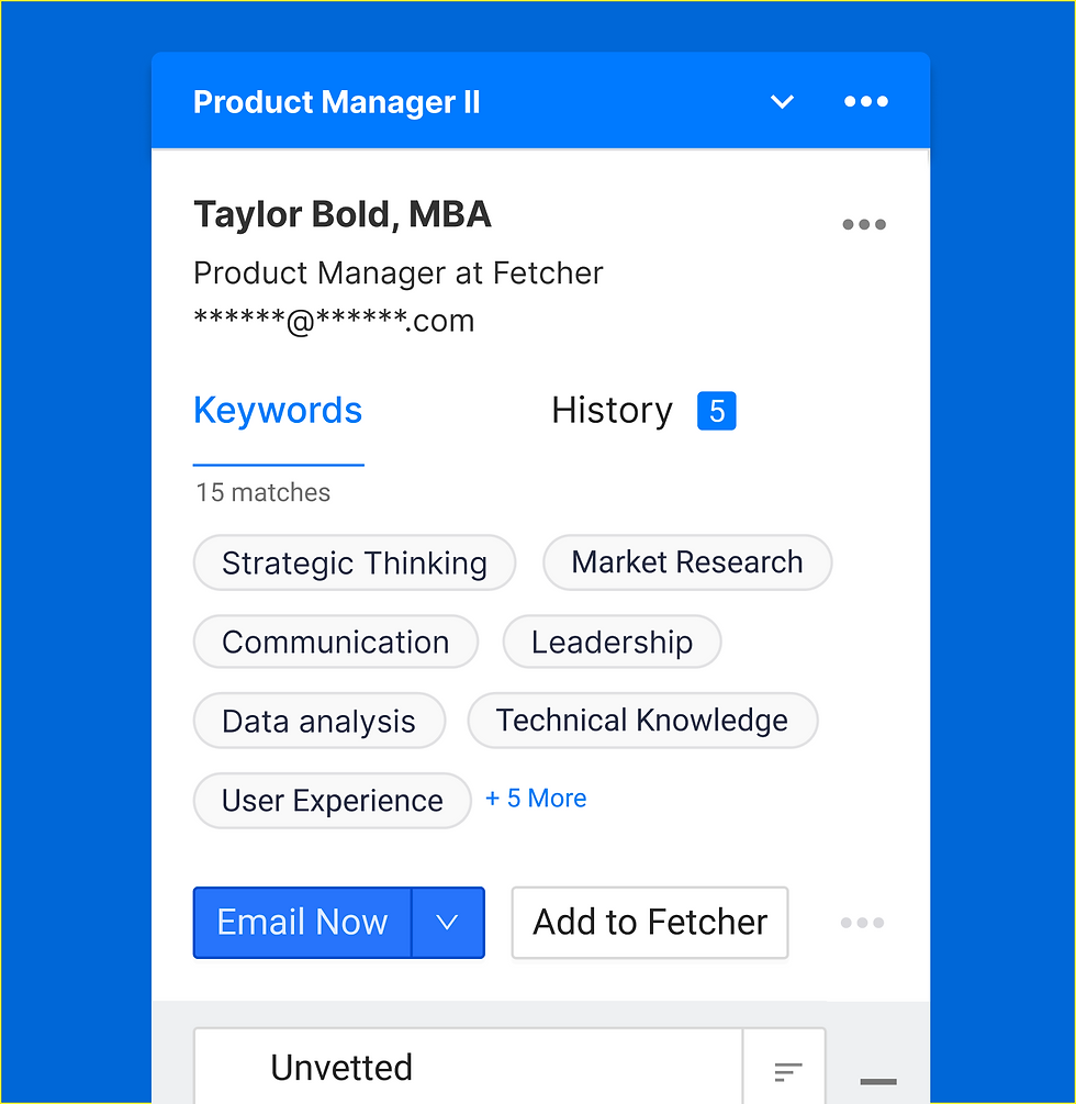
One key improvement was introducing a dropdown menu for the "Email" button, which offered more intuitive options. We also standardized terminology and optimized visual elements to create a streamlined experience that required fewer steps to complete tasks, enhancing efficiency and usability.

Creating a Cohesive Experience
The design phase involved adapting Fetcher's existing design system to suit the extension’s needs. I began by reviewing the current UI, then redesigned components using Figma to create a more intuitive, efficient layout. My focus was on reducing the steps needed to perform common tasks while maintaining a cohesive design across the platform.
We iterated on the design, refining workflows and visual elements to ensure a smooth user experience. By emphasizing accessibility, clarity, and consistency, the new design offered an improved, user-friendly interface that met the demands of recruiters.

Validating the Redesign
To validate the redesign, we created two prototypes for A/B testing: one retaining the original workflow and another with the redesigned interface. We tested both versions with six clients, measuring task completion success rates on core MVP features, such as saving profiles and sending emails.
The redesigned prototype was favored by users, who appreciated the simplified workflows and clear instructions. Testing results showed significant improvements in task efficiency and user satisfaction, providing valuable feedback that guided final design adjustments before implementation.

Major changes
After carefully examining the test results, we identified areas that needed improvement. As a result, we made significant changes to the Fetcher Extension in order to achieve our goals. These key modifications were implemented.
Fetcher Intro:
In order to enhance usability, we prioritized placing the instruction directions at the top of the extension instead of burying them under the keywords tab. This change was implemented to ensure easy access and clarity for users.

Background:
During our evaluation of the former extension and the prototypes we tested, it became evident that users were struggling to identify the initial steps and comprehend the instructions. To address this issue, we recognized the importance of incorporating a prominent contrast color in the background, coupled with the relevant text, to direct users' attention effectively. By implementing this solution, we aimed to provide a clear visual cue for users to easily identify and focus on the desired instructions.

Hover over vs. Modal:
Incorporating clear and concise instructions, we introduced an instructional hover-over above the disabled button. Initially, we considered utilizing a modal with a graphic, but given recruiters' emphasis on speed and efficiency, we prioritized streamlining the process and minimizing unnecessary steps. Therefore, the instructional hover-over was implemented as a more effective solution.

Email Button Dropdown:
In the initial version of the extension, a single button labeled "Email" lacked contextual clarity for users. To address this, we introduced a dropdown menu with multiple options. Through user feedback, we found that "Email Now" was the preferred choice, aligning with users' primary needs. However, we also included additional options in the dropdown to accommodate diverse preferences. Notably, during testing, all users unanimously expressed a preference for this revised approach over the original single-button design.

Terminology:
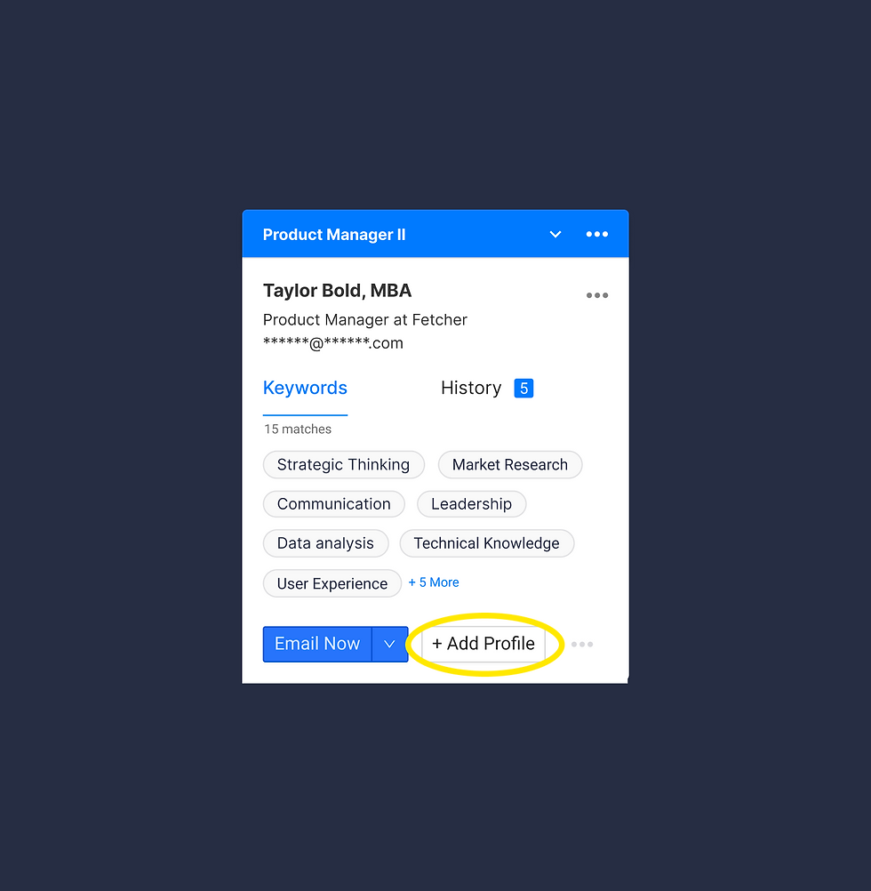
To ensure clarity for users, we made terminology changes across the Fetcher extension. We replaced "Matches" with "Keywords" to accurately represent word matches between LinkedIn profiles and job criteria, as validated by user feedback. Additionally, we switched from "+Add Profile" to "Add to Fetcher" to clearly indicate that a profile had been added to the Fetcher. These adjustments were implemented based on user validation and aimed to enhance user understanding and provide a more intuitive experience.

Add to Fetcher Flow:
In the previous extension, users were required to use their leads (currency) to view candidates and determine their suitability. In the updated version, we reversed the flow to allow users to assess the candidate's compatibility before utilizing their leads. This new approach allowed users to determine if it was a good match before investing their leads to contact the candidate. Feedback from users indicated that they preferred this revised flow compared to the previous method. By prioritizing the evaluation phase before lead expenditure, we aimed to enhance user satisfaction and optimize their decision-making process within the extension.
Communication Status:
Previously, users had to access different statuses of their communications with candidates through a web browser, which required navigating away from the extension. To improve convenience and accessibility, we implemented updates within the extension itself. Users can now view and access all communication updates with candidates directly within the extension, eliminating the need to switch to a separate web browser. This enhancement allows for a more streamlined and efficient workflow, providing users with immediate access to the latest information on their candidate interactions without any additional steps.

Results
In summary, these were the key changes we made to the extension, resulting in improvements to workflow, user-friendliness, and error prevention. Numerous additions were implemented, enhancing various aspects of the extension. We conducted a final testing round with a user, and all minimum viable products (MVPs) achieved a 98% success rate. Currently, we are actively collaborating with the engineering team to implement these changes.